Identity Brand Design for Raquis.
Established in 2021 by Andrés Vignoni as winemaker, Facundo Impagliazzo as agronomist and Ariel Núñez Porolli as director, Raquis defines a stylistic and conceptual node in Argentine wine.
"At the heart of the cluster is the raquis. Raquis is the Greek word for the backbone, but it is also the support and structure, the vital connection between the grape and the plant and at the same time a pure image of our purpose: we call ourselves Raquis because we are guided by nature, we are supported by values of austerity, honesty and naked beauty, typical of a contemporary luxury that values the precise detail, the balance between the scarce and the generous and that is moved by the life that vibrates in a glass of wine conscious of its origin and mystery". This is how they present themselves. A declaration of principles.
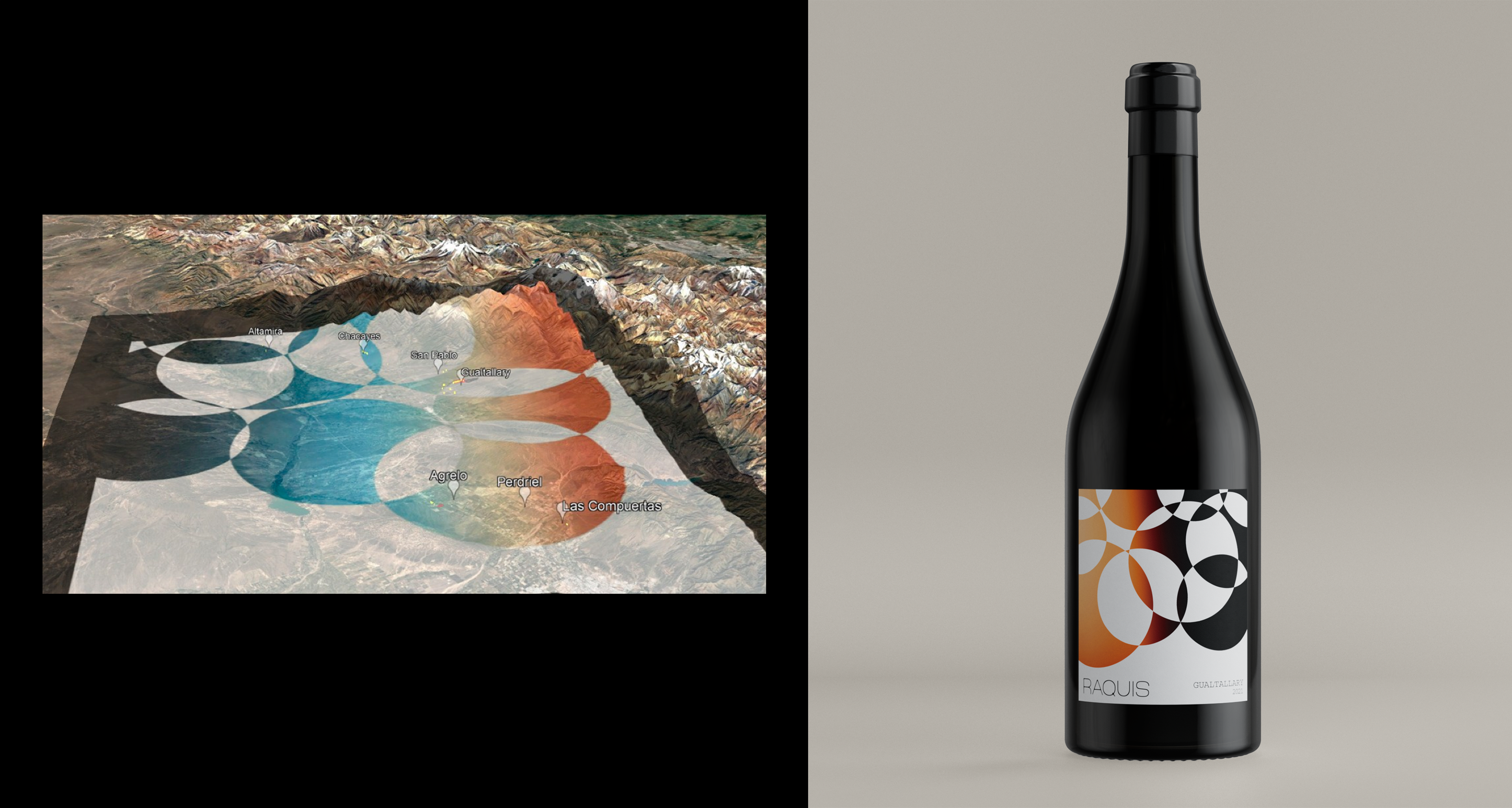
With grapes from Monasterio in Gualtallary, where they planted a vineyard on slopes and respecting the native flora, along with another vineyard in the foothills east of Agrelo, where they are building a winery, Raquis puts magic to the creation of wines.
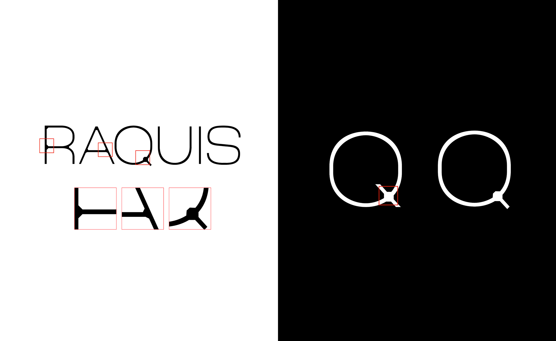
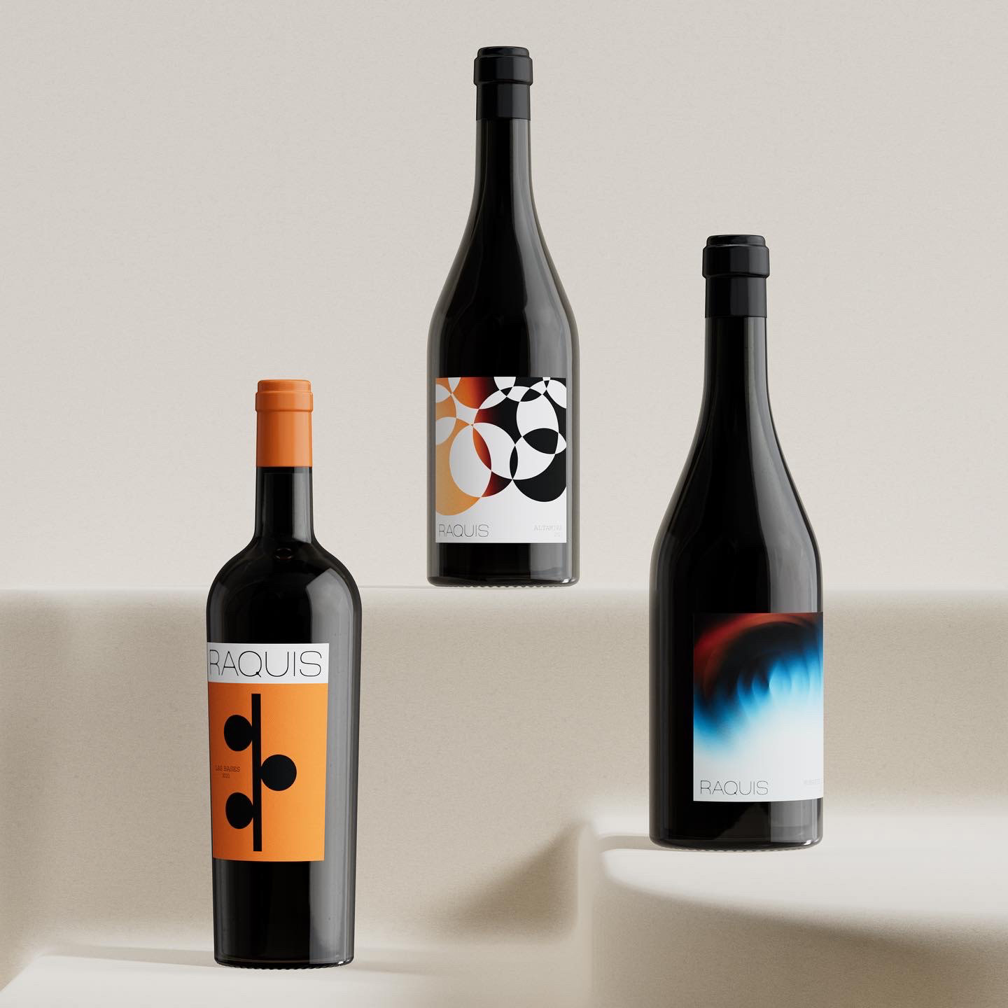
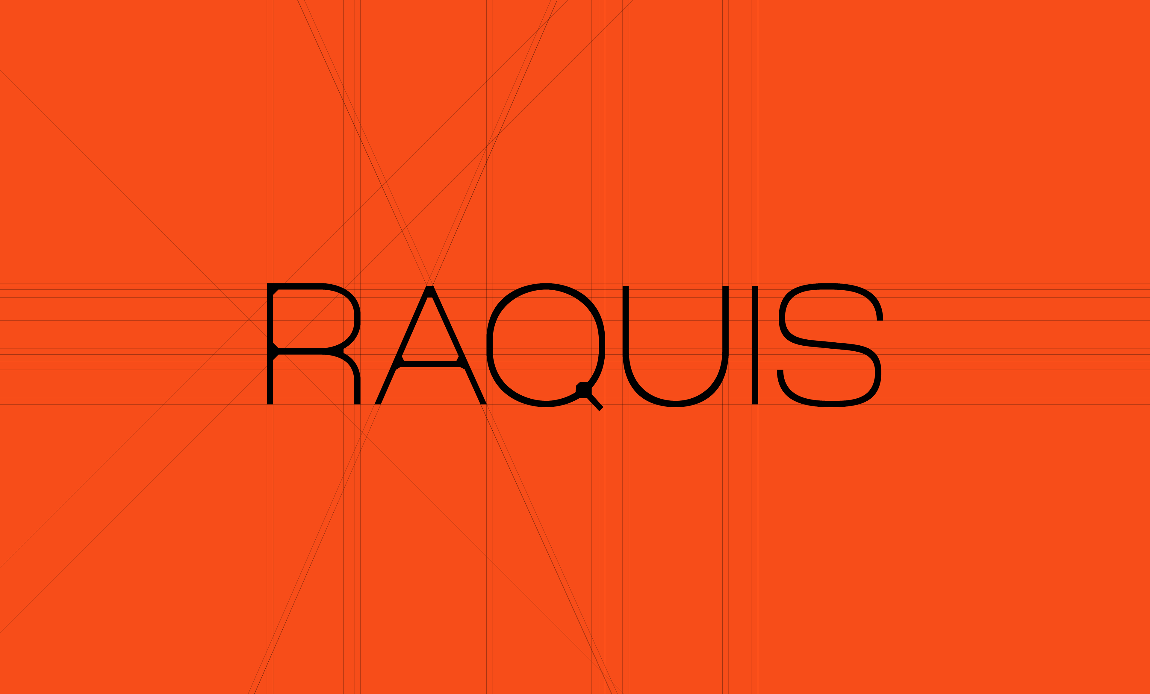
Its base is a san serif typeface called Lina Klassisch, which is inspired by elegance and robustness.
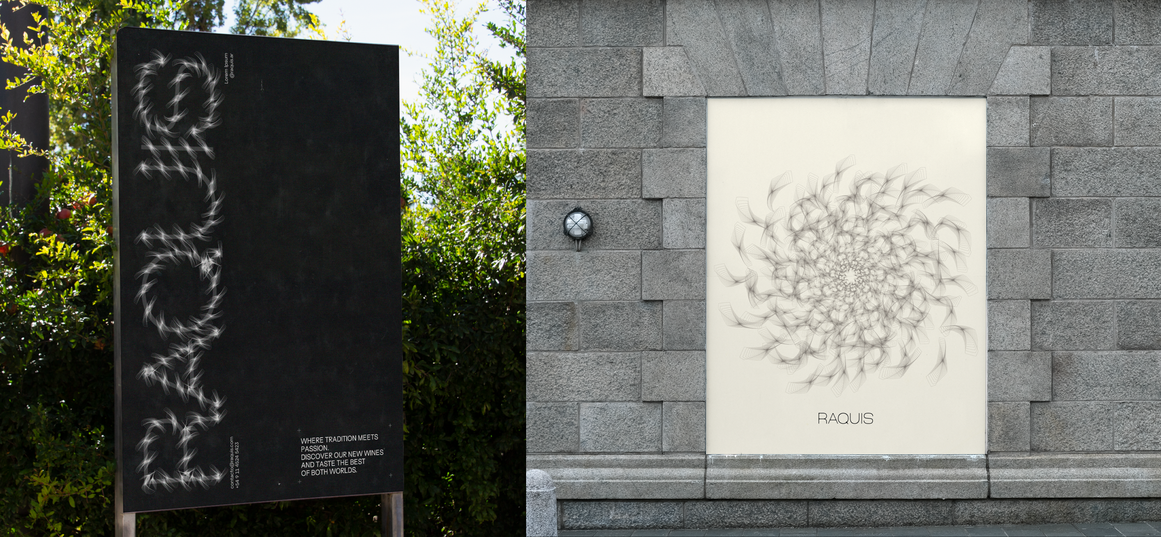
It conveys a sense of calm and sophisticated movement. It seeks to represent the vital link between the grape and the plant, while reflecting the nature and values of Raquis.
It conveys a sense of calm and sophisticated movement. It seeks to represent the vital link between the grape and the plant, while reflecting the nature and values of Raquis.
The values of austerity, honesty and naked beauty are reflected in the elegant and restrained typography, while the idea of contemporary luxury that values precise detail is communicated through the carefully designed features of the typeface. Demonstrating the winery's passion and respect for the nature and life found in every glass of wine.
The choice of typography, with its balance between rigid and flexible, emulates the way nature builds its rachis and connects the vine to its fruit.
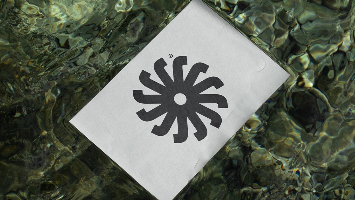
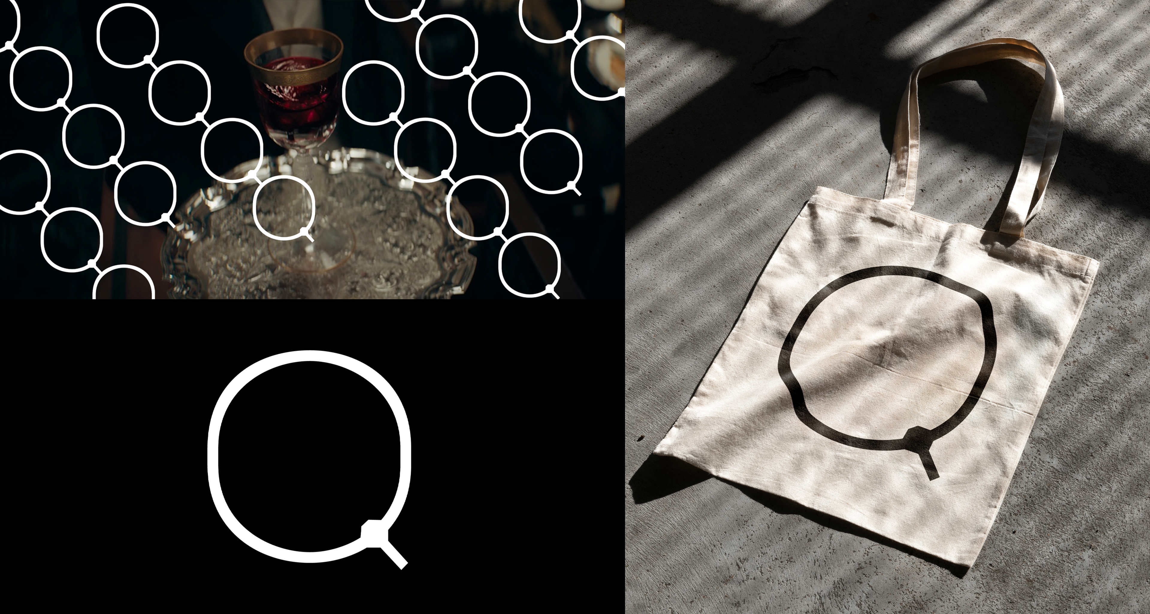
The "Q" in the Raquis logo becomes a key element symbolizing both the brand's backbone and the essential connection between the grape and the plant. In addition to its central position in the word "Raquis," the shape of the "Q" resembles the structure of a grapevine, with its characteristic branches and curves. This visual representation directly evokes the essence of the winery and its commitment to authenticity and connection with nature. It is a strategic decision that reinforces and amplifies the brand's core concepts. By incorporating both the backbone of the brand and the essence of the connection between the grape and the plant, the "Q" becomes a powerful symbolic element that reflects Raquis' philosophy, values and passion for producing authentic and meaningful wines.
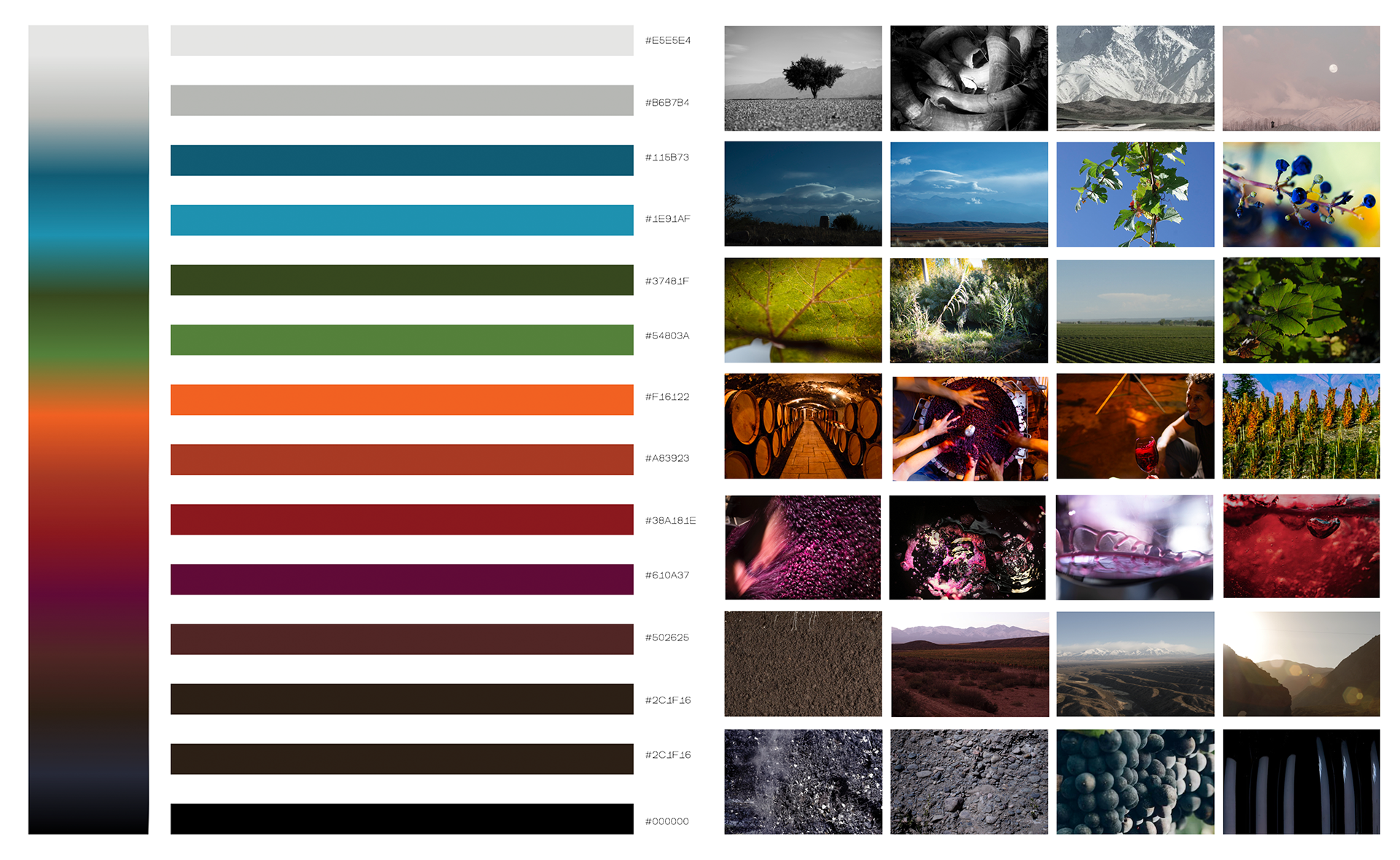
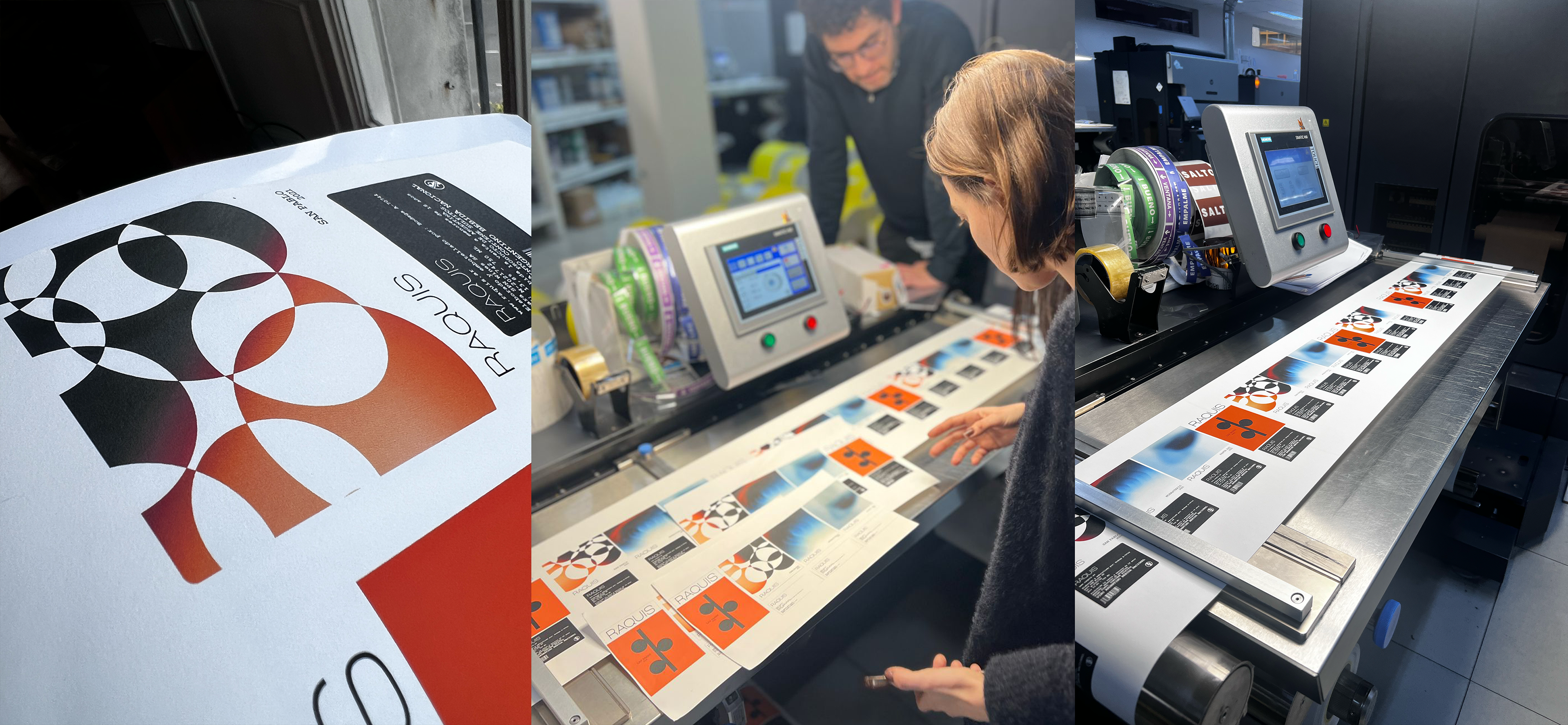
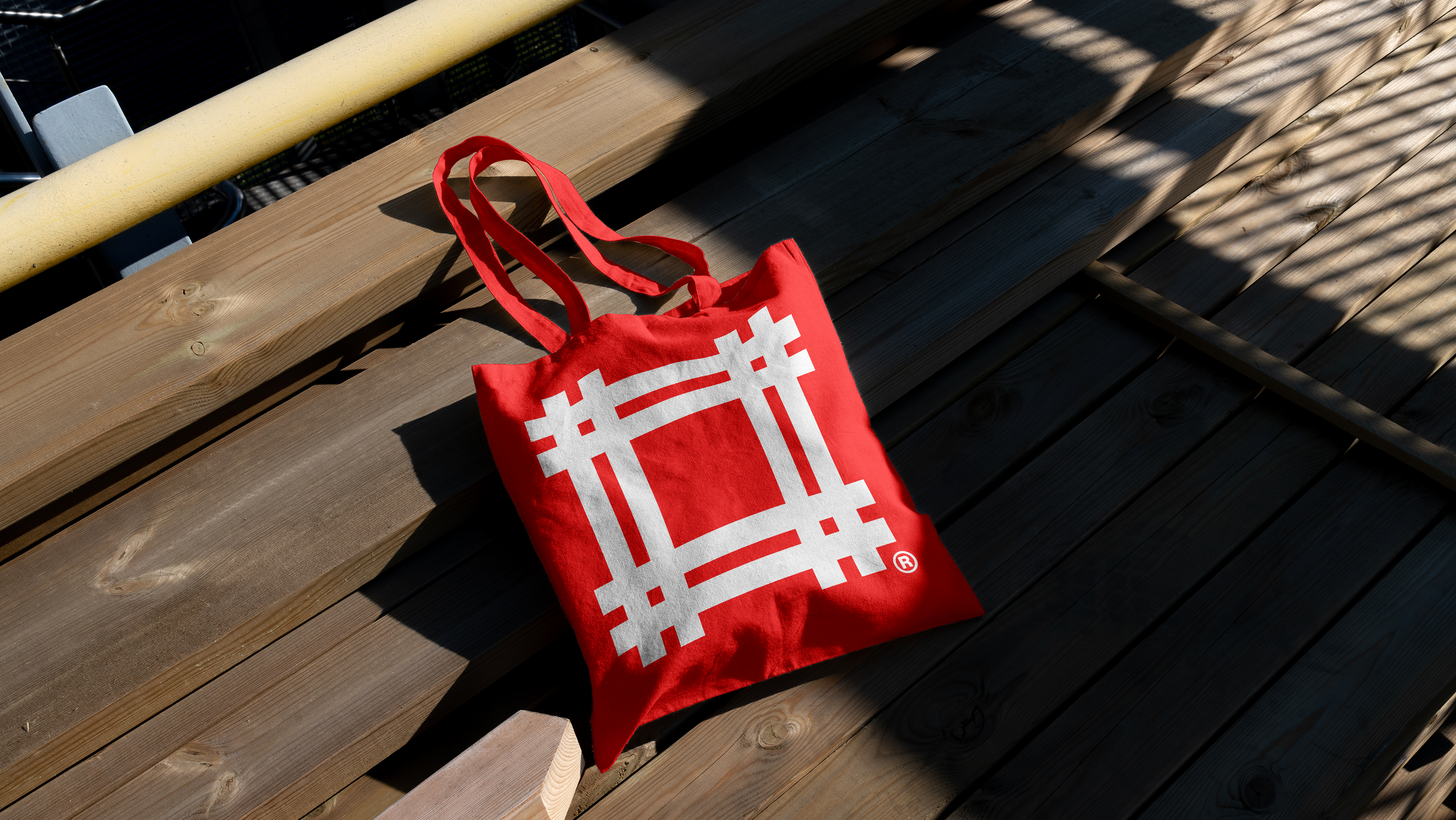
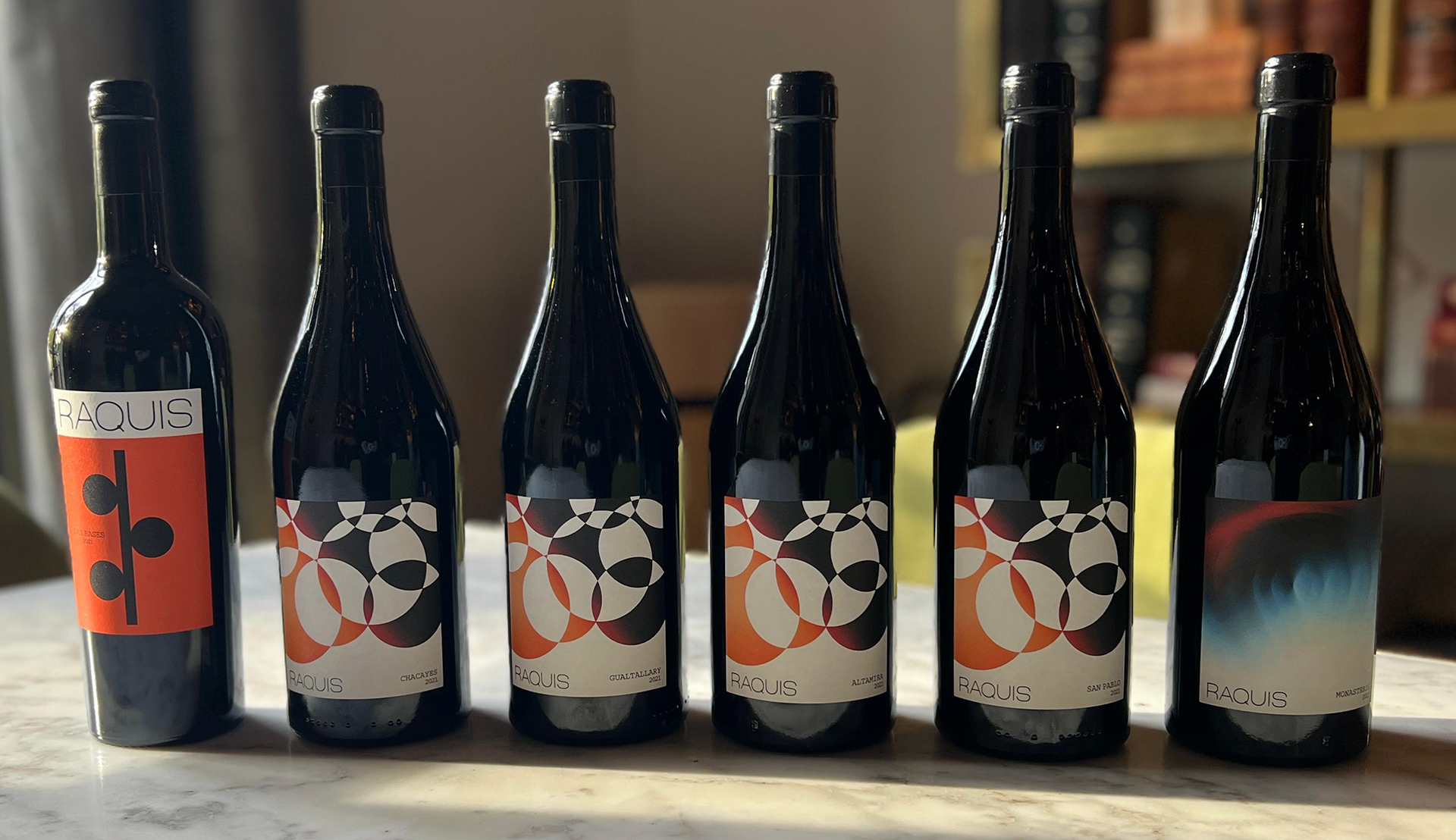
Miscellaneous created were thought from the maps of the plots.
The creation of these maps seeks to have a graphic support for the brand's communication in networks or the generation of patterns in the brand's graphic toolkit.